Bhaktinandan — Crafting a Premium Identity for Traditional Cold-Pressed Oils

Brand Identity Redesign
Packaging System Design
Label Design
Brand Communication
Bhaktinandan produces wooden cold-pressed oils using traditional extraction methods. As consumers become more conscious about what they eat, interest in traditional food practices has grown alongside it. People increasingly want to understand where their food comes from, how it is made, and what they are bringing into their homes. At the same time, shelves have become crowded with brands making similar promises. Authenticity alone is no longer enough. It has to be recognised.
The ChallengeModernising Heritage Without Losing Authenticity
The cold-pressed oil category sits at an interesting intersection of tradition and contemporary consumer expectations. While heritage creates trust, presentation influences choice. Many brands either lean too heavily into nostalgia or move so far towards modernity that they lose the very qualities that make them distinctive. Bhaktinandan needed an identity and packaging system capable of expressing quality, trust, and tradition without appearing outdated. The challenge wasn't to reinvent the brand. It was to communicate its existing values more clearly and confidently.
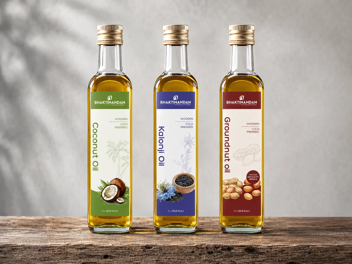
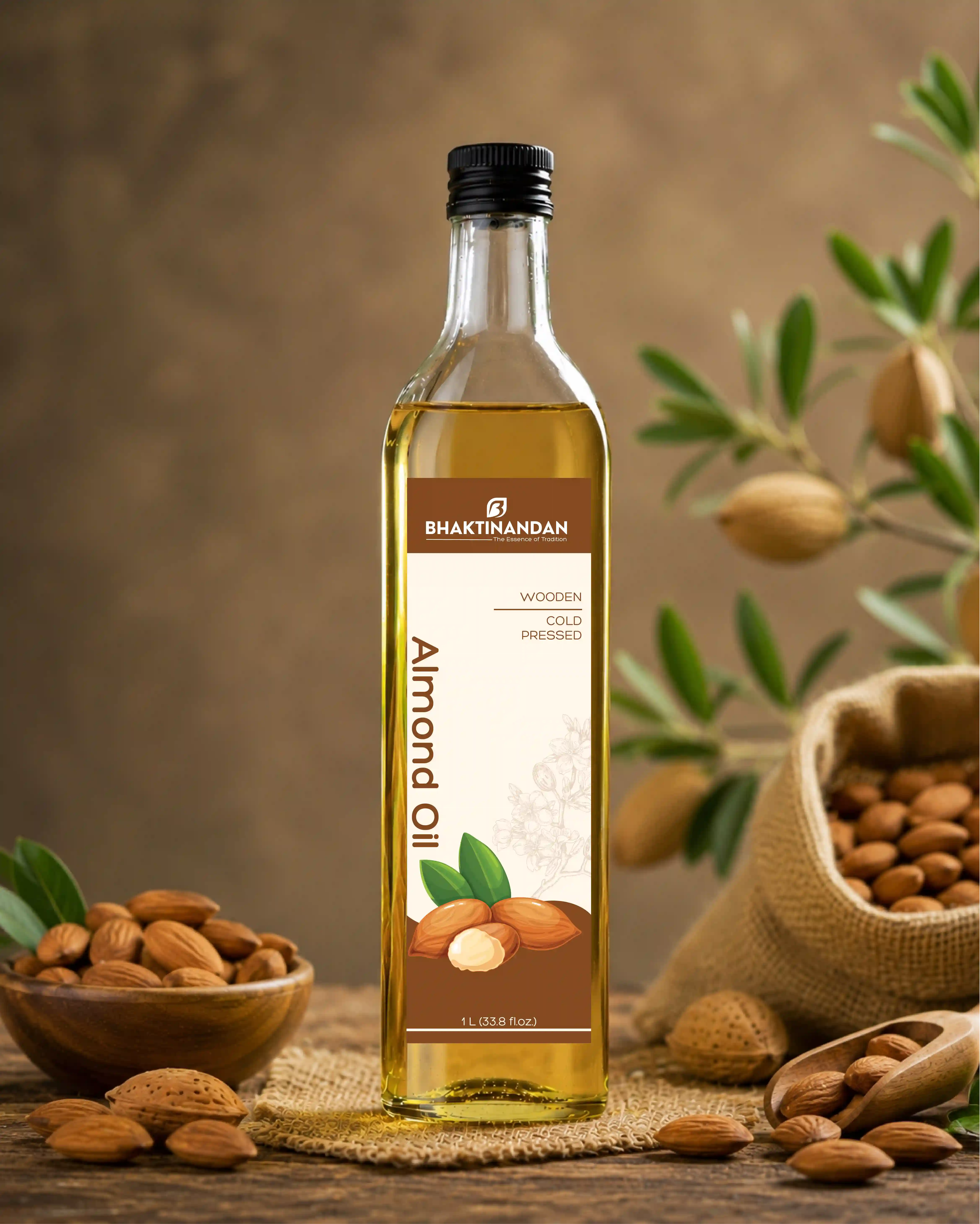
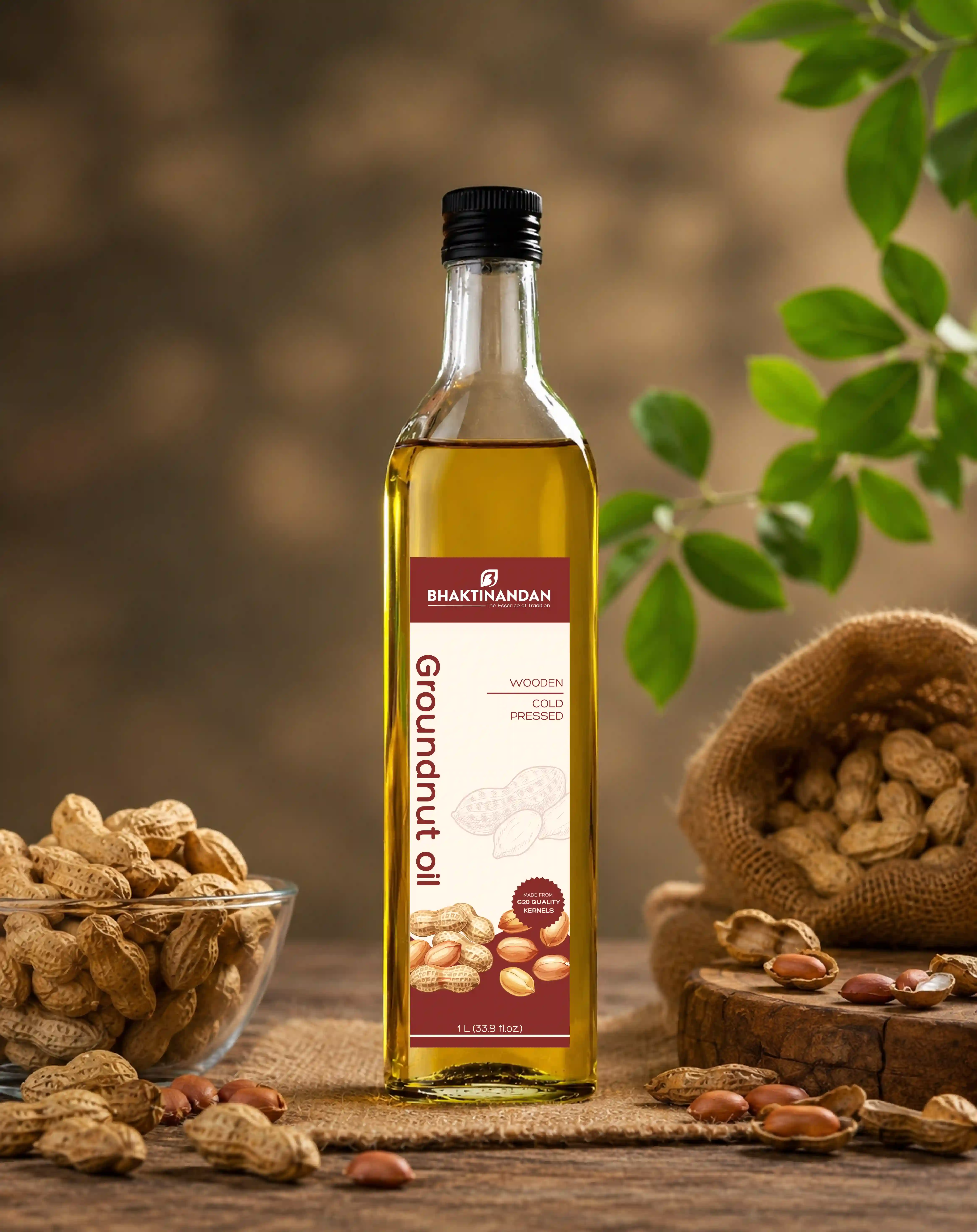
We redesigned the identity, packaging system, and labels around the ideas of purity, simplicity, and authenticity. The visual language was contemporary while remaining rooted in the product's heritage. Information hierarchy, typography, colour application, and packaging structure were carefully considered to improve readability and create a stronger shelf presence. The objective was to help consumers quickly understand what made the product valuable without relying on exaggerated claims or borrowed aesthetics. Every design decision aimed to support the same message: Traditional processes can still feel relevant in a modern context.
The rebrand created a more cohesive and premium presence across packaging and supporting communication materials. Bhaktinandan gained a visual system that better reflected the care, craftsmanship, and integrity behind its products. Because when the process has remained thoughtful for generations, the brand should honour that same level of intention.